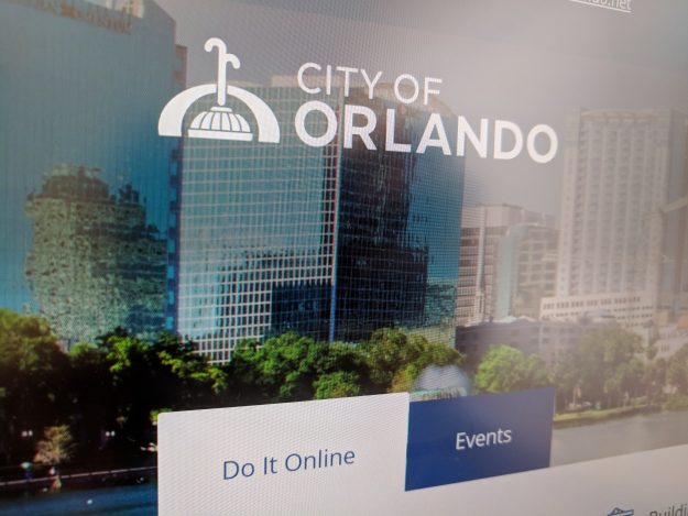
Don’t be fooled by Orlando city government’s website redesign

Orlando announced the launch of the public beta of a new city-government website Friday. But officials told StateScoop the site is merely a facade for a much deeper overhaul of both the city’s internal processes and how administrators think about service delivery.
“This is way less about a website redesign a way more about a digital transformation,” said Matt Broffman, Orlando’s innovation director.
The city’s new website replaces an alpha version of the website that was launched in summer 2017, after the creation of the city’s digital service academy, a three-day workshop designed to make city staff think critically about their services.
The academy, Broffman said, “empowers the staff to understand what it’s like to interact what their service as a resident and identify the improvements they would want to make on behalf of the residents and prototype and go make those improvements.”
So far, 70 staff members have passed through the academy, Broffman said, and all of them have liked how the process adjusted their services. And the changes to those services, he said, are reflected through adjustments to the city’s website.
Natalie Bednarz, the city’s digital communications coordinator, explained that the city is rethinking its “flow of information,” starting with a service request from a user and ending with the city sending information back after the relevant agency acts on it.
Since launching the academy, the city has also hired Anna Higgins as the city’s service designer to seek out residents who might not typically leave feedback online or attend city council meetings, such as residents of elder-care facilities and organizations that work with disabled people.
That user testing, Broffman said, has repeatedly surprised city staff and continues to inform process and design decisions, and also the attitudes of city staff who now realize that being an “expert” doesn’t mean knowing everything.
Broffman pointed to the new website’s options button, an icon with three horizontal lines designers often call a “hamburger” button. The button was added for the alpha launch of the website, with officials assuming it would eventually be phased out, since some user experience designers have in recent years claimed the button is an ineffective way to engage users. But user testing upended his team’s predictions.
“When our service designers went out into the community [and talked to] every population demographic, people know how to use it just as well as they know how to use a regular horizontal menu. And so we kept it,” Broffman said. “Every time we do user research, even on our feedback tab, the negative feedback we get on our hamburger menu is always from digital experts telling us we shouldn’t have it — never from residents who can’t figure out how to use it.”
While the public may only see a revamped website, Broffman said, it’s a sign of a culture shift in local government.
“We don’t have to debate things internally about what’s the right way to do something,” he said. “We can build a prototype or test an assumption by asking a resident and talking with them.”
The “final” version of Orlando’s new website is scheduled to launch early 2019.
“It’s never done,” Broffman said. “But if we do this right, there won’t ever be another website redesign because it’s constantly going to be going through iterative changes as we get feedback.”


